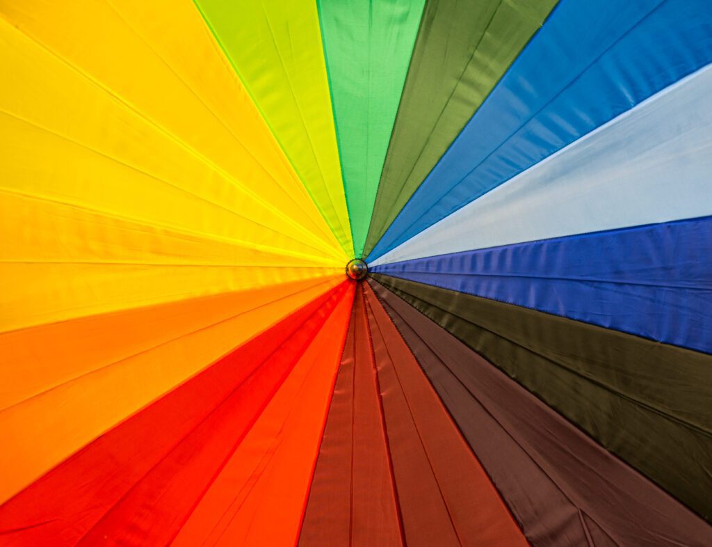
Color isn’t just an aesthetic choice—it’s a strategic branding tool that shapes how people feel, think, and behave when they interact with your brand. Studies show that up to 90% of first impressions about a product or brand are made based on color alone.
Used well, color can:
- Boost memory recall
- Drive purchasing decisions
- Build instant trust and recognition
- Set emotional tone and brand perception
Let’s dive into the power of each color, how to use it effectively, and which pairings and industries benefit most from each.
🔵 Blue — Trust, Reliability, Calm
Emotional trigger: Stability, peace, professionalism
Ideal for: Finance, tech, healthcare, corporate brands
Example brands: Facebook, PayPal, American Express, IBM
Best pairings: Blue + White (clean/corporate), Blue + Orange (trust with energy), Blue + Gray (serious and modern)
Use when: You want to build long-term trust and convey security. Especially effective in high-stakes industries like banking or SaaS.
🔴 Red — Passion, Urgency, Power
Emotional trigger: Excitement, intensity, action
Ideal for: Food, sports, fashion, entertainment, sales
Example brands: Coca-Cola, Netflix, Target, YouTube
Best pairings: Red + Black (bold and aggressive), Red + White (clean energy), Red + Yellow (fast food + fun), Red + Gold (luxury passion)
Use when: You want to stimulate appetite, trigger urgency, or provoke a strong emotional response. Great for sales buttons (think “Buy Now”).
🟢 Green — Growth, Health, Wealth
Emotional trigger: Renewal, prosperity, nature
Ideal for: Health, wellness, environment, finance
Example brands: Whole Foods, Tropicana, Land Rover, Spotify
Best pairings: Green + White (fresh and clean), Green + Brown (natural/earthy), Green + Gold (luxurious wealth), Green + Blue (tech + nature)
Use when: Your brand is tied to sustainability, wellness, or organic living. Also effective for money-related messaging.
🟡 Yellow — Optimism, Clarity, Energy
Emotional trigger: Joy, creativity, alertness
Ideal for: Startups, kids’ brands, lifestyle, travel
Example brands: McDonald’s, Nikon, Snapchat, Ferrari (accents)
Best pairings: Yellow + Black (high visibility – road signs, urgency), Yellow + Gray (modern and intelligent), Yellow + Blue (sunny trust)
Use when: You want to attract attention quickly or boost mental stimulation. Works well for limited-time offers and energetic brands.
🟣 Purple — Creativity, Royalty, Wisdom
Emotional trigger: Imagination, luxury, spirituality
Ideal for: Beauty, coaching, high-end products, innovation
Example brands: Cadbury, Hallmark, Twitch, Yahoo
Best pairings: Purple + Gold (royalty/luxury), Purple + White (clean mystique), Purple + Teal (creative + modern), Purple + Black (mystical drama)
Use when: Your brand leans into creativity, transformation, or appeals to women and luxury buyers.
🌸 Pink — Femininity, Playfulness, Compassion
Emotional trigger: Nurturing, romance, charm
Ideal for: Beauty, skincare, fashion, lifestyle, nonprofit
Example brands: Barbie, Glossier, Victoria’s Secret, T-Mobile
Best pairings: Pink + White (soft and minimal), Pink + Black (chic contrast), Pink + Gold (elegant femininity), Pink + Teal (fresh contrast)
Use when: You’re targeting women, promoting self-care, or building a joyful and welcoming brand.
🟠 Orange — Confidence, Creativity, Friendliness
Emotional trigger: Enthusiasm, fun, extroversion
Ideal for: Fitness, entertainment, startups, food & beverage
Example brands: Fanta, Harley-Davidson, Nickelodeon, Amazon (accents)
Best pairings: Orange + Navy (trust + energy), Orange + Gray (modern, balanced), Orange + White (playful), Orange + Red (bold & daring)
Use when: You want to appear approachable and energetic without the intensity of red.
🟤 Brown — Groundedness, Simplicity, Dependability
Emotional trigger: Earthiness, warmth, comfort
Ideal for: Coffee, natural products, craftsmanship
Example brands: UPS, Hershey’s, M&M’s
Best pairings: Brown + Green (organic/nature), Brown + Cream (warm minimalism), Brown + Gold (luxury rustic), Brown + Blue (rugged + trustworthy)
Use when: You want to evoke tradition, warmth, and a handmade touch. Perfect for artisan and rustic brands.
⚫ Black — Elegance, Power, Sophistication
Emotional trigger: Mystery, exclusivity, authority
Ideal for: Fashion, luxury, tech, photography
Example brands: Chanel, Nike, Apple (used with white/gray), Tesla
Best pairings: Black + White (high contrast, timeless), Black + Gold (opulence), Black + Red (high drama), Black + Purple (regal intensity)
Use when: You want to stand out boldly, create contrast, or command attention in a premium market.
⚪ White — Purity, Simplicity, Clarity
Emotional trigger: Cleanliness, openness, truth
Ideal for: Healthcare, wellness, tech, minimal brands
Example brands: Apple, ASOS, Tesla, The North Face
Best pairings: White works with everything. It’s best used as negative space or a base to allow other colors to shine.
Use when: You want clarity, professionalism, or to highlight content over design.
Pro Tip: Use Color With Intention
A powerful color strategy is more than just picking a favorite shade—it’s about using color psychology + contrast + consistency to align with your brand’s values, voice, and audience.
Ask yourself:
- What emotion do I want people to feel when they land on my site?
- What industry am I in—and how can I stand out without clashing?
- Will these colors still resonate 3–5 years from now?
Need Help Choosing the Right Palette?
If you’re building or rebranding your website, I can help you create a color system that attracts your ideal clients, boosts conversions, and reflects your brand’s identity from the first glance.
Reach out today for a free 15-minute brand review.
Let’s make your first impression unforgettable — in full color.

